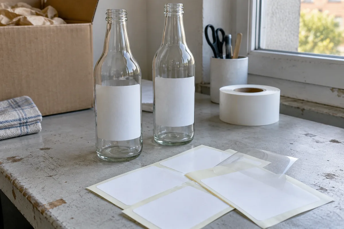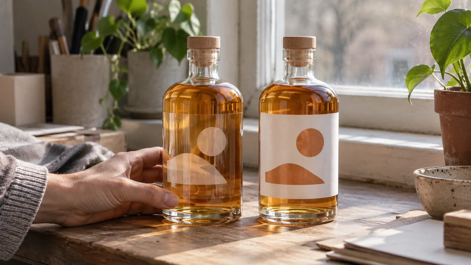
Choosing clear or white labels from a flat preview can waste a proof revision when copy loses readability against the actual filled-bottle background. Compare finished samples on the same actual bottle and contents, with white ink and transparent areas marked in the artwork record.
Start with the view you want the assembled package to show. A clear label allows the bottle and contents to contribute to that view; a white label supplies a white face behind the print, with its actual opacity and finish still part of the sample. This is an appearance-planning comparison compiled from public supplier guidance, not our own testing or a ranking of label materials.
| Input or item | Typical value or source | Why it matters |
|---|---|---|
| Bottle and fill | Identified project samples | Establishes the background behind the label |
| Clear and white construction | Exact supplier codes | Identifies what the samples actually represent |
| Artwork and white backing | Versioned files and printer proof | Separates intentional clear areas from backed print |
| Viewing conditions | Recorded light, background and direction | Makes the two appearance observations comparable |
| Print and finish | Supplier-confirmed process and finish | Avoids comparing different finishing choices unknowingly |
Images on this page are generated editorial photos for illustration, not actual packages, test records or performance evidence.
Compare both options against the same background
Use the same bottle, contents and viewing setup for both label options. United Ad Label describes how the package contributes to the view through a clear label, and Sticky Business asks buyers to establish the container surface and color. Our proposed record makes those variables explicit before an appearance preference becomes an approval.
| Decision factor | Clear option: record | White option: record |
|---|---|---|
| Intended visible contents | Which areas reveal the bottle and fill | Which areas the face covers in the actual sample |
| Copy and graphic appearance | Observed text, color and overlap against that background | Observed text and color on the white face |
| Empty versus filled view | What changed when the bottle was filled | What changed with the same fill condition |
| Surface appearance | Visible edge, haze, adhesive pattern or finish | Visible edge, face and finish |
| Sample identity | Face/adhesive/print/finish and artwork revision | The same fields for the white candidate |
Do not label unmeasured sample appearance “better contrast” as if it were a quantified result. Write a specific observation, such as which copy was difficult to read and from which direction. For component identities, use the pressure-sensitive construction record. The materials section helps distinguish the construction decision from this visual comparison.
Takeaway: Compare the same assembled package background before preferring a label color.
Mark white ink separately from transparent areas
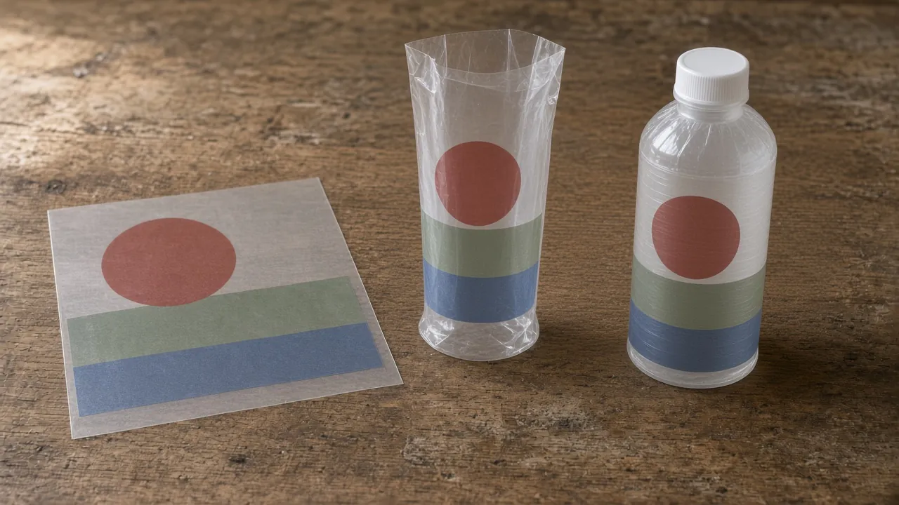
A clear face material and a white-ink backing are separate design choices. Sticky Business explains that CMYK does not include white unless the printer specifies white capability. Mark the intended backing and open areas explicitly, then ask the printer to show how those instructions are represented in the actual proof.
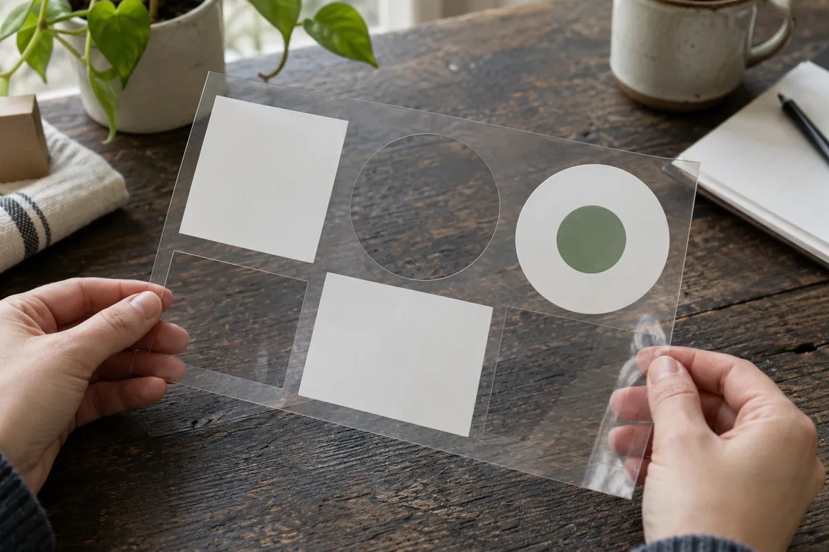
Illustrative photo — generated editorial image, not a test record, customer package or performance evidence.
Mark white backing and intentional clear areas separately in the artwork instructions. At a glance: Color artwork · Selected white backing · Clear film · Open clear area.
| Artwork area | Instruction to record | What to look for on the proof |
|---|---|---|
| Deliberately transparent window | No intended white backing or other print coverage in the marked window | The intended bottle/fill remains visible |
| Color area intended to have backing | Separate marked white layer or printer-approved instruction | The sample shows the intended backed area |
| White copy or design element | Supplier-confirmed white printing method | Actual white appearance on the intended bottle |
| Boundary between clear and backed regions | Match the artwork revisions and region map | Actual relationship between printed edges and backing |
These are artwork instructions, not promises of opacity or registration tolerance. Record the printer’s actual proof and document what remains unresolved. The printing and application section groups these decisions with physical application observations.
Common mistake: Treating the white background of an artwork preview as an instruction to print white on clear film.
Takeaway: Show the printer where white belongs and where transparency is intentional.
Record the empty and filled bottle views
Approve the intended filled state as well as any useful empty-bottle reference. Both cited guides connect clear-label appearance with the package background. The observation table below separates changes in that background from changes in artwork or construction, so the team can identify what it actually approved.
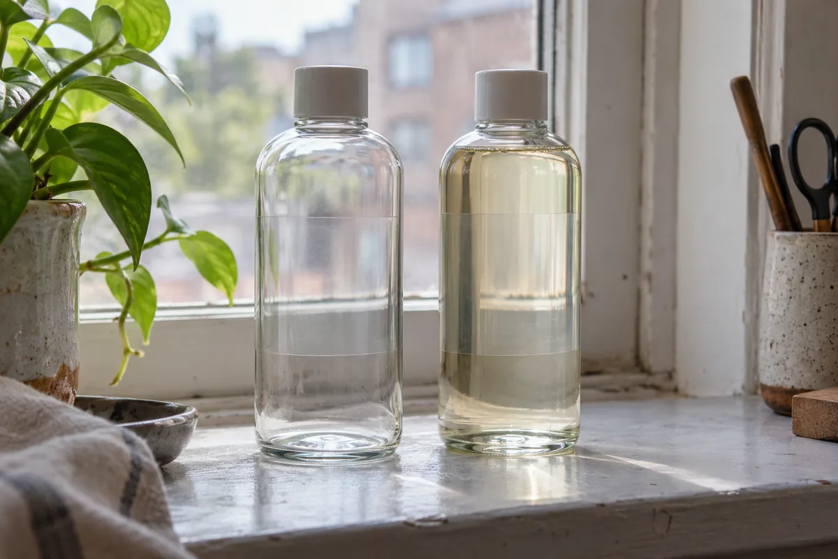
Illustrative photo — generated editorial image, not a test record, customer package or performance evidence.
Record empty and filled views independently rather than assuming they look identical.
| Observation record | Entry to make |
|---|---|
| Sample and revision | Bottle ID, label construction, artwork and proof revision |
| Empty-bottle view | Front, back and turned-view observations |
| Filled-bottle view | Actual contents and the same views; any substitute belongs in a preliminary record with its limitations and pending actual-content review |
| Background and light | Description of the setup and photographs showing it |
| Copy to review | Specific passages and graphic boundaries under discussion |
| Difference observed | Describe the change without inventing a contrast measurement |
| Review decision | Accepted item, unresolved item and who will supply the next proof |
Copy this paired observation sheet for each viewing setup; underscores are unfilled project entries, not measured results. Use the same bottle/content and setting IDs across candidates.
| Candidate and state | Sample / bottle / content ID | Artwork / white-layer revision | Viewing setup / photo ID | Observation / unresolved item |
|---|---|---|---|---|
| Clear — empty | ___ | ___ | ___ | ___ |
| Clear — actual fill | ___ | ___ | ___ | ___ |
| White — empty | ___ | ___ | ___ | ___ |
| White — actual fill | ___ | ___ | ___ | ___ |
A substitute-fill observation is preliminary: record why it was used, which background conditions it does not represent, and what requires review with the actual contents before final appearance approval.
If the opposite panel is visible through the package, record its relationship to the front view. The historical Ethos case explains that reported front/back relationship without offering a current artwork specification. On a small shaped container, establish the actual wall area first with the small bottle and jar label-zone record.
Takeaway: Keep the filled-bottle observation beside the exact sample revision.
Questions to resolve before the next proof
Turn an uncertain visual observation into a specific proof request. Sticky Business recommends requesting samples to inspect material, adhesive and ink options. Our editorial suggestion is to apply those identified samples to the intended bottle and contents for the paired observation. Request the actual construction and artwork rather than another flat preview when the unresolved issue comes from the bottle background or the applied label surface.
Keep the recorded observations with the sample that was approved. At a glance: Mark artwork areas · Identify the sample · Observe both views · Keep the proof record.
- Which sample construction and artwork revision will the next proof represent?
- Which regions are intentionally clear, printed white or backed with white?
- Which bottle and contents will be used for the appearance review?
- Which front, reverse and turned views will be recorded?
- Which finish belongs to each candidate, and is the team comparing matching finishes?
- Which observation can the printer resolve with a revised proof, and which needs another applied sample?
These are editorial checklist prompts, not attributed search questions. Separate a surface defect from an artwork issue using the bubbles, wrinkles and lifting observation record. Record the upstream condition using the label-ready bottle handoff if the sample was labeled after filling and capping.
For California cannabis artwork, use the AB 2249 image-review checklist to keep regulatory design questions separate from this appearance proof.
Takeaway: Ask for a proof that changes the unresolved variable and keeps the others identifiable.
When this does not apply
This comparison does not establish adhesive suitability, material resistance, recyclability, a white-ink coverage percentage or a cost advantage. A “no-label look” is an appearance aim, not a guarantee that the applied label edge or adhesive is invisible. Supplier guides provide useful questions, but the exact finished construction and intended conditions need their own evidence.
When the decision is between film constructions, use the BOPP, PET and PE conditional matrix. The clear-versus-white proof record remains useful alongside that matrix, but cannot determine a polymer choice by appearance alone.
Takeaway: Use an appearance proof for visual approval and construction evidence for material suitability.
Method and sources
Compiled from Sticky Business and United Ad Label guidance, reviewed October 8, 2026. Both are supplier explanations. We used their descriptions of transparent backgrounds, white backing and sample review; broad environmental and recycling assertions were excluded. The matched comparison and observation tables are editorial suggestions, with no original measured results.
Version record: October 8, 2026 — new assembled-package appearance record.
Takeaway: A supplier explanation helps plan the proof; the identified assembled package supports appearance approval.